When the president of Nintendo of America calls unexpectedly, you answer without hesitation.
That was the advice designer Chris Maple received from a colleague in 1998, preparing him for a pivotal call later that day. Maple, no stranger to urgent executive requests, ran Media Design, a Seattle-based firm known for tackling time-sensitive projects that larger agencies couldn’t handle. Though rarely credited publicly, his company earned a strong local reputation, working with clients like Boeing, the Seattle Mariners, and Holland America Line.
Maple had years of experience when Minoru Arakawa’s secretary at Nintendo of America invited him to their Redmond office. Told only that the project involved a new game, Maple accepted, unaware he was stepping into a role that would shape a global phenomenon: Pokémon.
Bringing Pocket Monsters to the West
“I waited in their lobby for about half an hour, captivated by a stunning 21-inch crystal horse head,” Maple recalls of his visit to Nintendo’s Redmond headquarters. “It set the tone. In corporate settings, I read the room, picking up cues about what needs fixing. That crystal horse head in Nintendo’s lobby stuck with me.”
Soon, Maple was ushered into a meeting room where a small group awaited. “It felt like an inquisition was about to begin,” he says. But when Arakawa arrived, his commanding presence was unmistakable. “You could see why he was in charge.”
Maple shares what happened next:
“Arakawa explained they were launching a game in the U.S. and Europe, but previous agencies had missed the mark, burning through budget and time. He asked if I was up for it. I said, ‘Absolutely, but it’ll cost you.’”
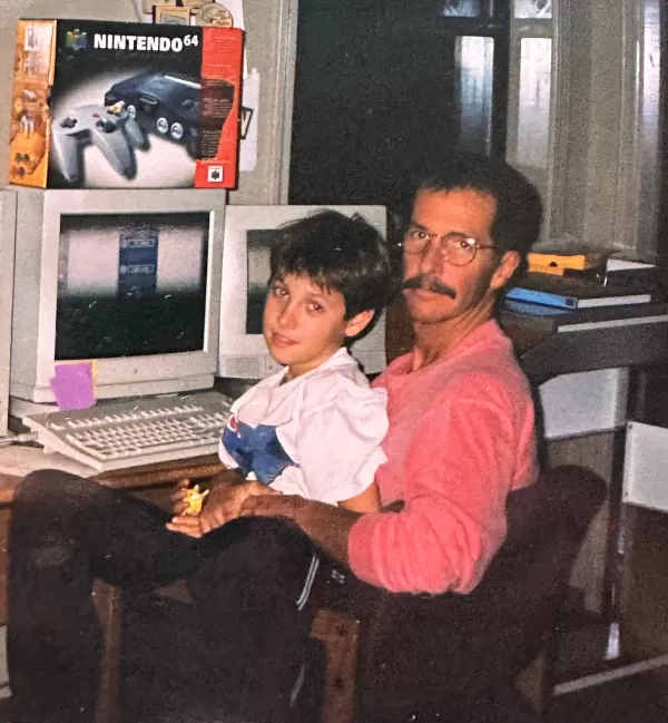 Maple with his son in his home office. Photo courtesy of Chris Maple.
“Then someone brought in a cardboard box and dumped toys, papers, and odd sketches on the table. I looked at Arakawa, confused, and asked, ‘What’s this?’ He replied, ‘It’s a Pocket Monster.’ I said, ‘What’s a Pocket Monster?’ He clarified, ‘It’s Pokémon. That’s what we’re calling it.’”
Maple was tasked with designing a new logo for Pokémon, which existed in Japan as Pocket Monsters Red and Green. Nintendo planned to launch Red, Blue, and later a Yellow Pikachu Edition in the West, needing a rebranded logo to match the shift to “Pokémon.” With just one month and no clear direction, Maple faced a daunting challenge.
The Elusive Crystal Horse Head
For days, I’ve scoured the internet for the crystal horse head Maple vividly recalls. It was his first impression of Nintendo, subtly influencing his approach to the logo that became a global icon. Yet, no trace of it exists online. It’s absent from rare videos of Nintendo’s old lobby (the company relocated in 2010, and the former office is now a tennis court). Former employees and visitors from that era don’t recall it, though some suggest Maple may have seen a less public lobby. Nintendo ignored my inquiries, and The Pokémon Company, not yet fully formed in 1998, offered no clarity. Industry veterans, DigiPen, and The Video Game History Foundation also turned up nothing.
Update 7:21 a.m. PT: Shortly after this article went live, a tip led me to David Sheff’s book Game Over, which confirms the horse head’s existence on page 198: “In the lobby of NOA’s headquarters is a smoky glass coffee table and a crystal horse’s head in a glass case.” I’ve contacted Sheff for further details or photos.
If you know anything about this mysterious crystal horse head or have a photo, please contact me at [email protected]. I’m eager to learn more.
Infusing Energy into the Design
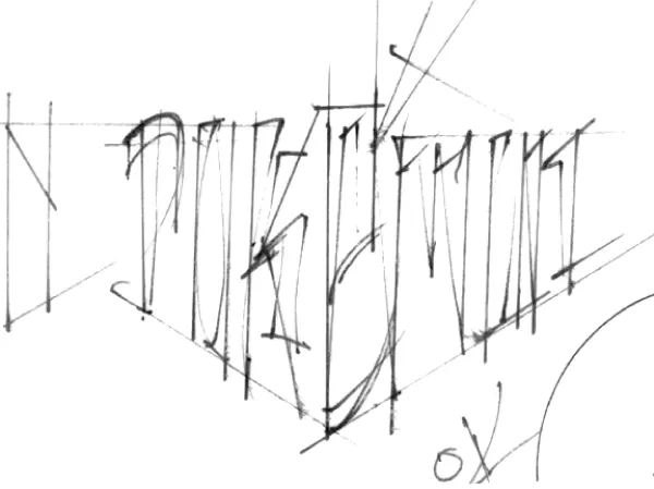
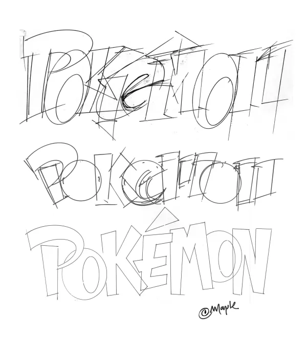
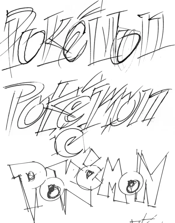
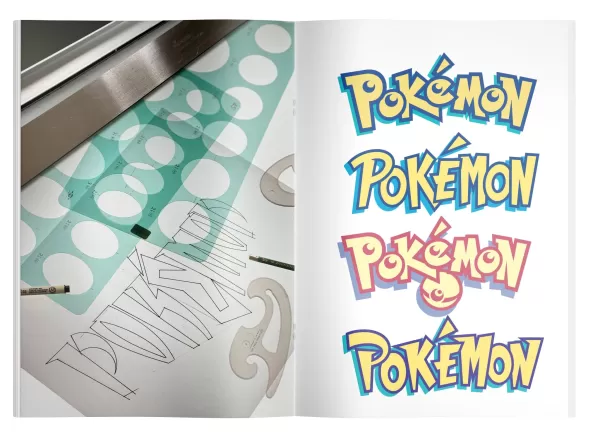
Typically, a logo like this would take six months with extensive revisions. Nintendo’s one-month deadline, tied to Pokémon Red and Blue’s E3 1998 reveal, was unrelenting. Maple, accustomed to tight timelines, dove in. He hand-drew multiple logo variations on a light table, experimenting with letter shapes and setting aside favorites to create diverse options for Nintendo.
Original Pokémon Logo Sketches by Chris Maple
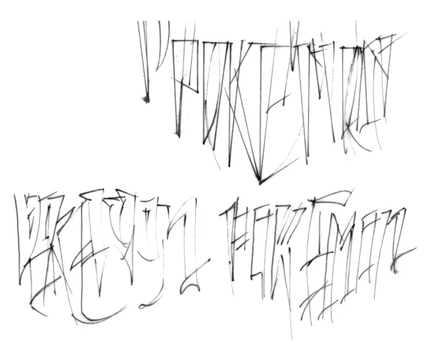
View 8 Images
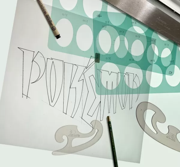
Maple had little to work with—no game copies, just toys and papers, including a tiny Pikachu figurine. Nintendo briefly explained the game and shared early monster illustrations and a draft of a Nintendo Power magazine featuring Pokémon. The logo needed to work on a pixelated GameBoy screen in both color and black-and-white.
Presenting his designs to Nintendo, Maple started with options he felt less confident about, receiving lukewarm reactions. Then he revealed his favorite. “The room went silent,” he recalls. “Then Don James, a Nintendo executive, said, ‘I believe this is the one.’ He nodded, ‘Yep, that’s it.’ Arakawa agreed, and I was told to produce it.”
Why did Maple and Nintendo love it? “It’s the energy,” he says. “I tapped into the story behind the game, imagining its potential.”
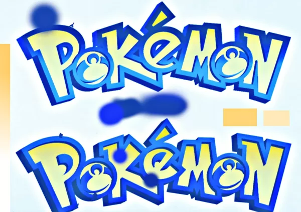 Color tests for the Pokémon logo, courtesy of Chris Maple.
The yellow-and-blue color scheme, Maple admits, may have been inspired by the Blue and Yellow game versions, though he insists it was instinctive. “It just felt right,” he says. “I know it sounds vague, but it’s true.”
Once approved, Maple stepped back as Nintendo handled marketing and release. Months later, at Toys R Us with his son, he was stunned by a massive Pokémon display. “The logo was everywhere—on arches, TVs, everywhere. I thought, ‘This is wild.’”
A Lasting Legacy
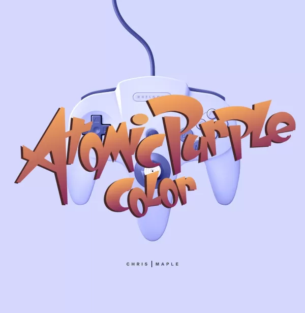
Maple’s work with Pokémon didn’t end there. Post-E3, Arakawa requested slight tweaks to the logo’s “P” and “E,” resulting in the version used today. Maple later contributed to other Nintendo projects, including designs for Major League Baseball Featuring Ken Griffey Jr., Mischief Makers, and possibly Star Wars: Rogue Squadron, plus the Atomic Purple Nintendo 64 box.
 The initial Pokémon logo Maple submitted, before adjustments to the P and E.
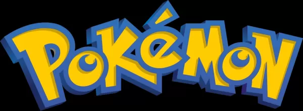 The final Pokémon logo with Maple’s tweaks, as seen today.
Maple played Pokémon briefly but was too busy to dive deep. His son collected the trading cards until they were banned at school. “My daughter would tell people, ‘My daddy did that logo,’ and moms in stores would jokingly blame me,” he laughs.
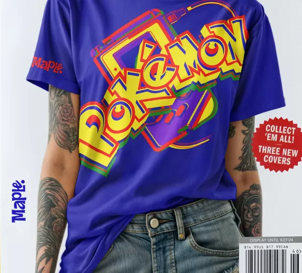
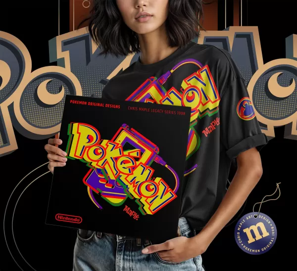
Maple’s work with Nintendo eventually tapered off as the company built its in-house design team. For years, he stayed silent about his Pokémon role, per industry norms and restrictions. Recently, encouraged by his son, he began sharing his story, adding the logo to his website with T-shirt mock-ups.
Chris Maple Modern Mock-up Logo Images
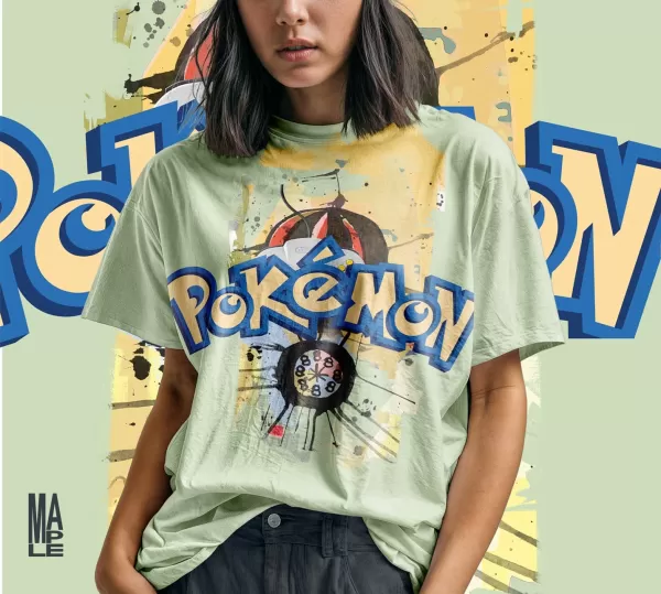
View 4 Images
If he could revisit the logo, Maple would revert to his 1998 original, before tweaks. Looking ahead to Pokémon’s 30th anniversary in 2026, he hopes The Pokémon Company might involve him. “If they add ‘30th’ to the logo, it needs care,” he says. “I’d love to do it right—for the story, the energy, and the fans.”
Maple’s brief work on Pokémon—a single logo—has left a mark on a global phenomenon. Beyond Pikachu, it’s the franchise’s most iconic symbol. Does he feel responsible for its success? “I feel good about doing it right for the kids and fans who’ve embraced it,” he says. “Teaching kids in tough areas, they go wild when they learn I designed it. I draw the logo on classroom boards, and it’s a hit. Those moments are priceless.”
 LATEST ARTICLES