The beloved plumber brothers, Mario and Luigi, almost received a grittier makeover in their latest game, but Nintendo intervened. This article explores the art direction process behind Mario & Luigi: Brothership.
A Style Evolution
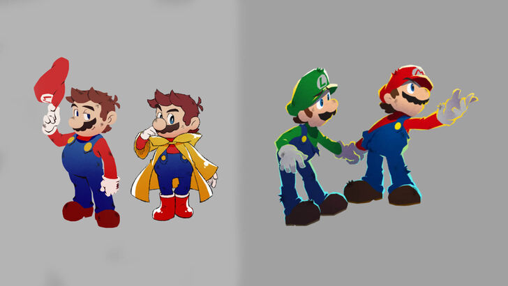
According to a December 4th Nintendo developer interview, Acquire, the game's developers, initially envisioned a more rugged, edgier Mario and Luigi. However, Nintendo felt this deviated too far from the established characters' identities. Akira Otani and Tomoki Fukushima (Nintendo) and Haruyuki Ohashi and Hitomi Furuta (Acquire) discussed the creative journey. Acquire aimed for "3D visuals that would bring out the unique appeal" of the series, leading to experimental designs, including the edgier iteration.
Furuta recounted the initial design, stating, "…we ended up trying to present an edgier, more rugged Mario." Nintendo's feedback emphasized maintaining the recognizable Mario & Luigi aesthetic. Subsequent discussions and a guiding document from Nintendo helped refocus the art direction. Furuta admitted initial concerns about whether the edgier design resonated with players.
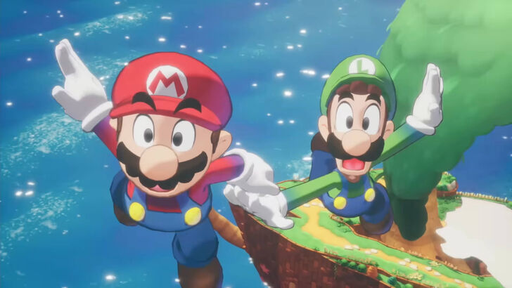
The final style blended "the appeal of illustrations featuring…solid outlines and bold, black eyes, and the charm of pixel animations." Otani highlighted the balancing act of allowing Acquire creative freedom while preserving the core Mario essence.
Development Challenges
Acquire, known for titles like Octopath Traveler and Way of the Samurai, typically produces less vibrant, more serious games. Furuta acknowledged their tendency towards darker RPG styles. Developing a game based on a globally popular IP also presented unique challenges for the studio.
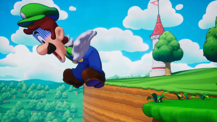
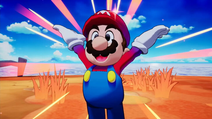
Ultimately, the collaborative process yielded positive results. The team focused on the series' fun, chaotic nature, incorporating Nintendo's design principles for clarity and accessibility. The final product is described as brighter and more user-friendly.
 LATEST ARTICLES